Computer Science > EXAM > CIS 240 Final Exam | Questions with Verified Answers (All)
CIS 240 Final Exam | Questions with Verified Answers
Document Content and Description Below
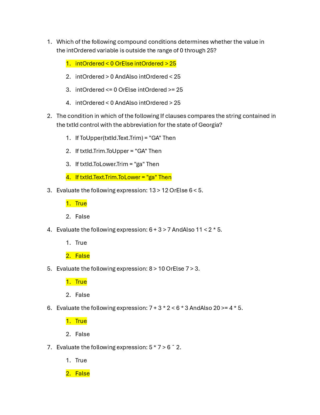
CIS 240 Final Exam | Questions with Verified Answers The more spread out the points on a scatter chart are away from the trendline, the_______ between the variables. - Higher the correlation - Low ... er the correlation - more likely the correlation doesn't change. - more effective the chart is Using examples of individuals rather than just talking about aggregate statistics, using pictures in your data visualizations, and creating context for large numerical values are all efforts to appeal to the audience using__________. - Ethos - Logos - Pathos - Movement Dashboards that are typically used by lower-level managers to monitor rapidly changing critical conditions are referred to as _______. - analytical dashboards - strategic dashboards - tactical dashboards - operational dashboards The data dashboard for a university foundation officer may include KPIs related to ______. - Sales by region - potential donors - the current financial standing of the company - the crime rate in different neighborhoods. a scatter chart_______. - has to do with electron scatter - is a graph of paired x and y values - must be linear - is a frequency graph of x values A dashboard that does not allow users to customize the data dashboard display is referred to as a(n) ________. - Noninteractive Dashboard - interactive dashboard - static dashboard - dynamic dashboard A vertical or horizontal arrangement of individual charts of the same type, size, scale, and formatting that differ only by the data they display is a_________. - Frequency polygon - scatter chart - histogram - pie chart The change over time of a single variable for multiple entities by connecting pairs of data points for each entity refers to a ________. - slope chart - pie chart - heat map - stacked horizontal bar chart What kind of chart makes use of a secondary axis to represent one of the variables so that both variables can be shown on the same chart? - Dual-axis chart - multidimensional chart - condensed chart - Bi-axis chart Which Excel tool works in the same way as a slicer, but works exclusively with date fields? - Timeline - Drill down - developer - data formula A noninteractive data dashboard is appropriate when the_______. - data do no change frequently - data change frequently - user wants to drill down and filter the data - organization's KPIs change rapidly Which of these represents the ability to show credibility in a story to your audience? - Ethos - Logos - Pathos - Empathy Quality control is an important issue at a manufacturing company, which manufactures Product Z. To test the lifetime of Product Z, the company randomly sampled nine products and measured how many days they lasted (mean = 346.6).378, 361, 350, 375, 200, 391, 375, 368, 321 What is the standard deviation? - 342 - 191 - 58.5 - 10.609 Which of these is not a poor graphing technique? - geographic information - labeled axis scales - 3D bar charts - rotated axis Decluttering can be achieved by all of the following EXCEPT: - using a legend to identify color coding - eliminating all grid lines - removing redundant information - decreasing the saturation The two types of charts that are helpful in making comparisons between categorical variables are _______. - bar charts and scatter charts - scatter charts and line charts - bar charts and column charts - column charts and line charts Which of these refers to connecting with the audience using emotion? - Ethos - Logos - Pathos - Empathy A chart that has a higher data-ink ratio and more white space - is more difficult for the audience to interpret - is easier for the audience to interpret - has no effect on how the audience interprets it - is less visually appealing A value a manager uses to operate and maintain their businesses effectively and efficiently is referred to as a_____. - A key performance indicator - data dashboard - trellis display - matrix A researcher wants to calculate the width of each interval by using the approximation formula. He first created a frequency distribution with 5 bins. The minimum and maximum for the variable are −32.40 and 65.42, respectfully. Calculate the width of each interval for the researcher. - 13.084 - 6.604 - 19.564 - -19.56 People associate green with envy in the United States, but yellow symbolizes envy to the French and Germans, which is an example of________. - color psychology - color symbolism - color perception - color analysis Dashboards that are typically used by analysts to identify and investigate trends, predict outcomes, and discover insights in large volumes of data are referred to as___________. - analytical dashboards - strategic dashboards - tactical dashboards - operational dashboards Which of the following is useful when you have two time periods or points of comparison and want to quickly show relative increases and decreases or differences across various categories between the two data points? - slope chart - pie chart - heat map - stacked horizontal bar chart Which of the following is a common mistake in data dashboard design? - Not considering the reason the organization wants to develop a data dashboard - using the gestalt principles in visualization creation - creating a dashboard with a high data-ink ratio - applying freytag's pyramid to the presentation Excel's Data Validation tool can be used to control what a user can enter into a cell, limiting ___________. - the ability to create data errors from manual entries - miscalibration of sensors that automatically collect data - biased data - none of these choices Composition is _______. - what makes up the whole of an entity under consideration - the relative order of items - how two variables are related to one another - how items are dispersed When the number of variables (columns) is large, the data are referred to as________. - wide data - tall data - big da Aspect ratio is ratio of the________. - width of a chart to the height of a chart - data ink to total ink used in a chart - data ink to white space in a chart - range of one variable to the range of another A simple alternative to using a dual-axis chart is to______. -use a frequency table for each variable instead - make the axes contrasting colors - replace the dual-axis chart with two charts where each variable is shown on a different chart - none of these choices A pattern in time series data that recurs periodically over a regular time interval refers to_________. - seasonality - trend - cross-sectionality - correlation Which type of hue evokes energy, passion, and danger? - color hues - warm hues - high luminance hues - low luminance hues Freytag's Pyramid divides a story into what five distinct elements? - Introduction, rising action, climax, falling action, and conclusion - Introduction, action, climax, reaction, and conclusion - Introduction, initiation, response, recovery, and conclusion - Introduction, problem, conflict, resolution, and conclusion A common mistake made by novice presenters is to present all the analysis that has been done for a project in the_________. - chronological order - freytag's pyramid order - reverse order - none of these choices The cultural meanings and significance associated with color refers to_____________. - color psychology - colorology - data visualization - color symbolism In a data visualization, most experts agree that text fonts should be _______ instead of _________. - sans-serif; serif - serif; sans-serif - larger; smaller - bold;italic Which type of hue is considered to be soothing, calming, and reassuring? - cool hues - warm hues - high luminance hues - low luminance hues A simple visual organization of the main points of the story used to provide structure of the narrative that you intend to create for the audience is called a_______. - storyboard - trellis board - matrix - none of these choices The data dashboard for a marketing manager may include KPIs related to__________. - sales by region - potential donors - the current financial standing of the company - the crime rate in different neighborhoods Quantitative scales refer to the___________. - range of quantitative values along the horizontal and vertical axes in a chart - number of categories in a categorical variable - width and height of a chart - range of one variable to the range of another Examining one column of a data set and focusing on the distribution of a variable's values is called __________. - univariate analysis - column analysis - exploratory data analysis - predictive analysis Missing Not at Random (MNAR) is_______ missing data for which the tendency for an observation to be missing a value of a variable is related to the missing value Survivor bias and selection bias are related because_______ - the sample data set consists of a disproportionately large number of observations corresponding to positive outcomes for a particular event - the sample data are not representative of the population that is being studied - the sample has not been properly randomized to represent the intended population - none of these choices Debra would like to create a graph to display the number of males and females in her class who scored an A, B, C, D, or F on the last test. Which of the following types of graph should she use? - stacked column chart - scatter chart - pie chart - heat map Which chart type is most appropriate to visualize the relationship between two quantitative variables? - column chart - pie chart - bar chart - scatter chart Which chart type is most appropriate to summarize data about categories? - bubble chart - histogram - bar chart - scatter chart Blue symbolizes masculinity in Europe and North America and femininity in China, which is an example of_________. - color psychology - color symbolism - color perception - color analysis Non-data-ink is the ink used that_________. - gives color to a chart or table - serves no useful purpose in conveying the data to the audience - is necessary to convey the meaning of the data to the audience A tabular summary of the statistical measure of a variable of interest with respect to two or more (typically categorical) variables is called a(n)________. [Show More]
Last updated: 9 months ago
Preview 4 out of 15 pages

Loading document previews ...
Buy this document to get the full access instantly
Instant Download Access after purchase
Buy NowInstant download
We Accept:

Reviews( 0 )
$15.00
Can't find what you want? Try our AI powered Search
Document information
Connected school, study & course
About the document
Uploaded On
Mar 06, 2025
Number of pages
15
Written in
All
Additional information
This document has been written for:
Uploaded
Mar 06, 2025
Downloads
0
Views
18

