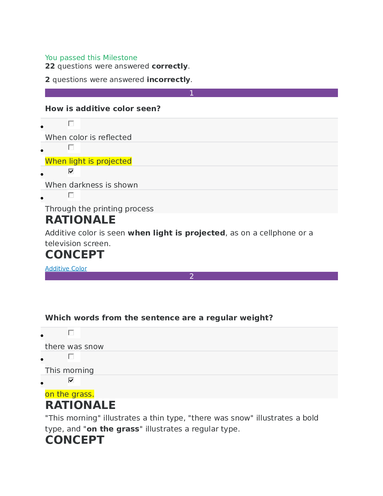
How is additive color seen?
•
When color is reflected
•
When light is projected
•
When darkness is shown
•
Through the printing process
2
Which words from the sentence are a regular weight?
•
t
...
How is additive color seen?
•
When color is reflected
•
When light is projected
•
When darkness is shown
•
Through the printing process
2
Which words from the sentence are a regular weight?
•
there was snow
•
This morning
•
on the grass.
3
Examine the two type examples. They are shown in the same point size. Why do they look different?
•
One of the fonts needs to be kerned.
•
The fonts have two different X-heights.
•
One of the fonts has been tracked very loosely.
4
Which image contains a caption?
•
•
•
5
Why do fast-food chains use red and yellow?
•
To lower your blood pressure, and catch your eye
•
To create a sense of mystery and raise your blood pressure
•
To appeal to children and reduce stress
•
To trigger appetite, happiness, and attraction
6
Which of the following statements is NOT true about this image?
•
The image shows a wide range of lightness.
•
The image shows a wide range of elements.
•
The image shows a wide range of temperatures.
•
The image shows a wide range of value.
7
Which of the following statements is true about this color wheel?
•
The color wheel is an additive color model and uses an arrangement of hues ordered by tertiary colors.
•
The color wheel uses the additive color model and is a circular arrangement of randomly ordered hues.
•
The color wheel uses the subtractive color model and is a circular arrangement of hues ordered as they appear in the light color spectrum.
•
The color wheel uses a subtractive color model and is a circular arrangement of tones arranged by levels of saturation.
8
Which statement correctly explains kerning?
•
Kerning is the spacing across a range of words in body copy.
•
Kerning is the white space between two lines of type.
•
Kerning is the version of a typeface that is wider than its regular form.
•
Kerning is the white space between two letters.
9
What are some of the characteristics of the Blackletter typeface?
•
Blacketter originated in the 1400's and is known for its symmetry and strokes of even weight.
•
Blacketter was based on ancient roman inscriptions and has a contrast between thick and thin strokes.
•
Blacketter was popularized by the Bauhaus movement and includes thin serifs.
•
Blacketter was based on written manuscripts and has elaborate, angular strokes.
10
Which element is featured prominently in this layout grid?
•
Captions
•
Gutter
•
Bleeds
•
Columns
11
Which list below describes the use of color in this painting?
•
Primary colors, the use of value, and saturation
•
Cool colors, the use of pigments, and analogous colors
•
Mixing of color with light, warm colors, and the use of darkness
•
Analogous colors, hexadecimal colors, and complementary colors
12
Which principles or elements of layout design are present in this event poster?
•
Columns and justified text alignment
•
Page spread and left text alignment
•
Hierarchy and centered text alignment
•
Caption and free form text alignment
13
Which image uses a golden section?
•
•
•
14
When red and grey are mixed together, the result is a different __________ of red.
•
shade
•
complement
•
tint
•
tone
15
What is the difference between a slanted typeface and an italic typeface?
•
Italic type is computer generated. Slanted type is based on hand-crafted script.
•
Italic type has poor readability. Slanted type has good readability.
•
Italic type is designed specifically to slant to the right. Slanted type is regular type that is slanted by a machine.
•
Italic type has serifs. Slanted type is sans-serif.
16
When laying out a project, why is it important to carefully consider spacing, typeface and posture?
•
These choices guide the eye to focus on the most important details first.
•
These choices produce easy reading, which is always the goal of design.
•
These choices prevent designers from placing text too close together.
•
These choices enable designers to generate the most creative design possible.
17
Which of the following terms describes the sketch in this photo?
•
Modular drawing
•
Wireframe drawing
•
Bleed drawing
•
WYSIWYG drawing
18
Which of the following defines a typeface?
•
Contains all capital letterforms, of consistent posture and width
•
Contains the name of the publisher, family, weight, posture and width
•
A member of a complete set of letters, numbers and punctuation symbols
•
A capital letter form using different weights and widths
19
Which style of type alignment is formal?
•
Centered
•
Right
•
Free form
•
Justified
20
Which of the following is an example of subtractive color?
•
An image, shown on a television screen
•
A photograph, printed on paper
•
A PowerPoint presentation, projected
•
A page layout, displayed on a computer screen
21
Which of the following color relationships is in this poster?
•
Split complementary color
•
Analogous color
•
Tertiary color
•
Complementary color
22
Which of the layout styles below is used in this image?
•
Big type
•
Picture window
•
Frame
•
Rebus
23
What is an important takeaway from Massimo Vignelli's work from the Unigrid System?
•
It was inspired by the de Stijl style's focus on primary colors.
•
He revised the way park maps are organized and laid out.
•
The approach makes it possible to maintain a consistent format across varied pieces of work.
•
His style proved that a grid is not necessary for a consistent appearance.
24
What is a way to tell if a font is TrueType or OpenType?
•
Platforms: Microsoft uses TrueType, Macintosh uses OpenType
•
Icons: a blue "TT" for TrueType, a teal "O" for OpenType
•
Extensions: ".TR" for TrueType, ".OP" for OpenType
[Show More]
